As I joined Atlon my responsibilities encompassed the overall product looks, feel and experience. Atlon is an iOS (watchOS) mobile app based on machine learning that aims to help CrossFit Athletes to track their workouts beyond just heart rate.
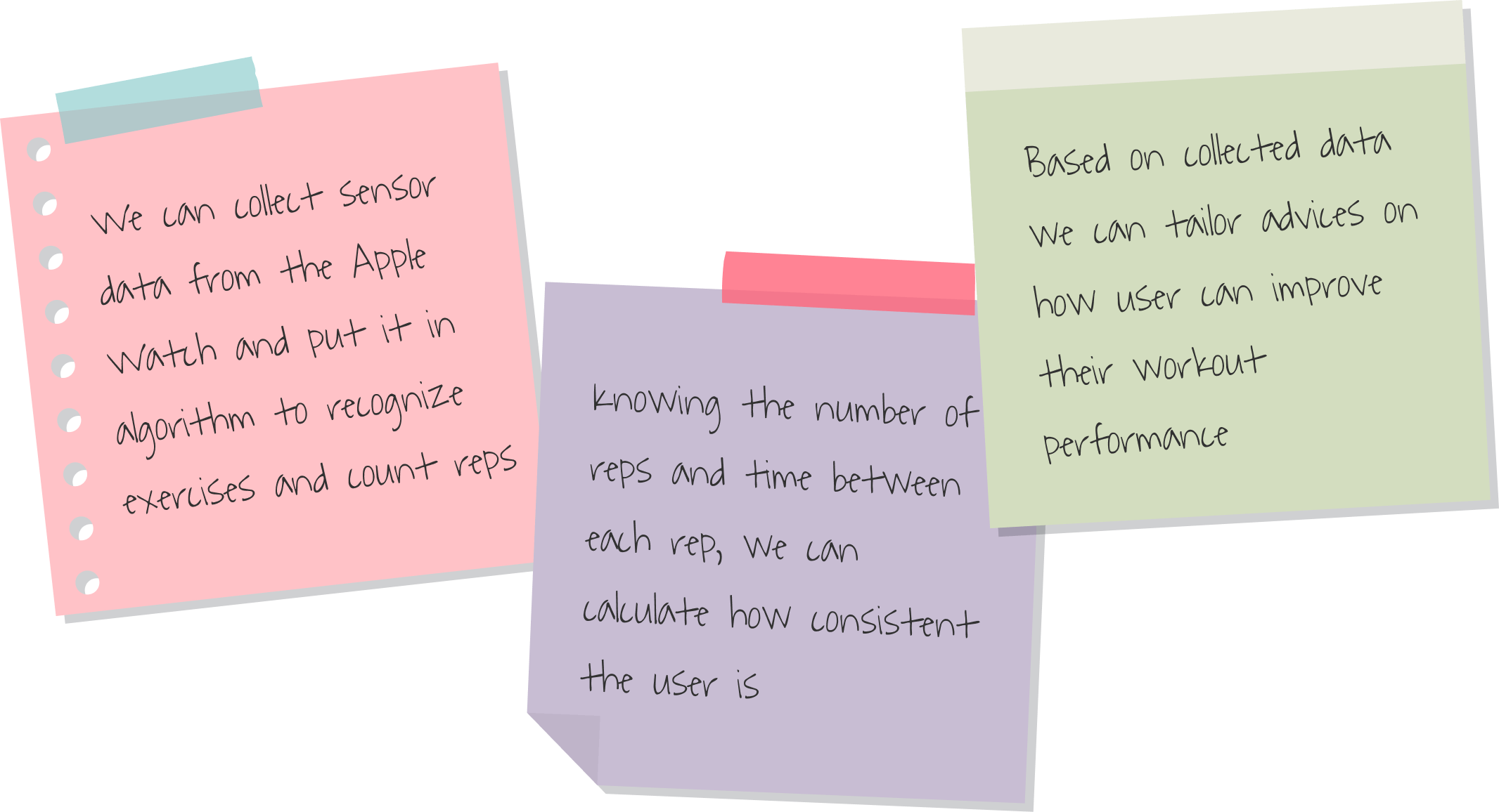
Consistency and Effort are the key factors towards success in CrossFit. With help of machine learning we wanted to make sure that every athlete gets a sense of how consistent their reps are, and see how much of an effort are they putting in.
The goal was to deliver a product that can help CrossFit athletes achieve better results in their fitness journey.

As a CrossFitter, I would like to have insights into my workouts and know if I’m getting better. I would like to have personalized tips on how to perform better in my training.
Lazar - CrossFit Athlete

It gave us a general understanding of what industry type our potential clients belong too, responsibilities, motivations and pain points.

I discussed with a small group of people in our gyms to test whether is there any interest in this kind of product.

Insights I got from interviewees, allowed us to develop a profile and a value map. Identifying pain relievers & gain creators for our customers.

I actively participated in brainstorming sessions, proposing and crafting solutions. Subsequently, I documented these ideas as assumptions and organized them based on their associated risks.
SYNTHESISING USER RESEARCH INTO A VALUE PROPOSITION
Atlon empowers CrossFit athletes by automatically tracking workouts and capturing insights beyond just heart rate.
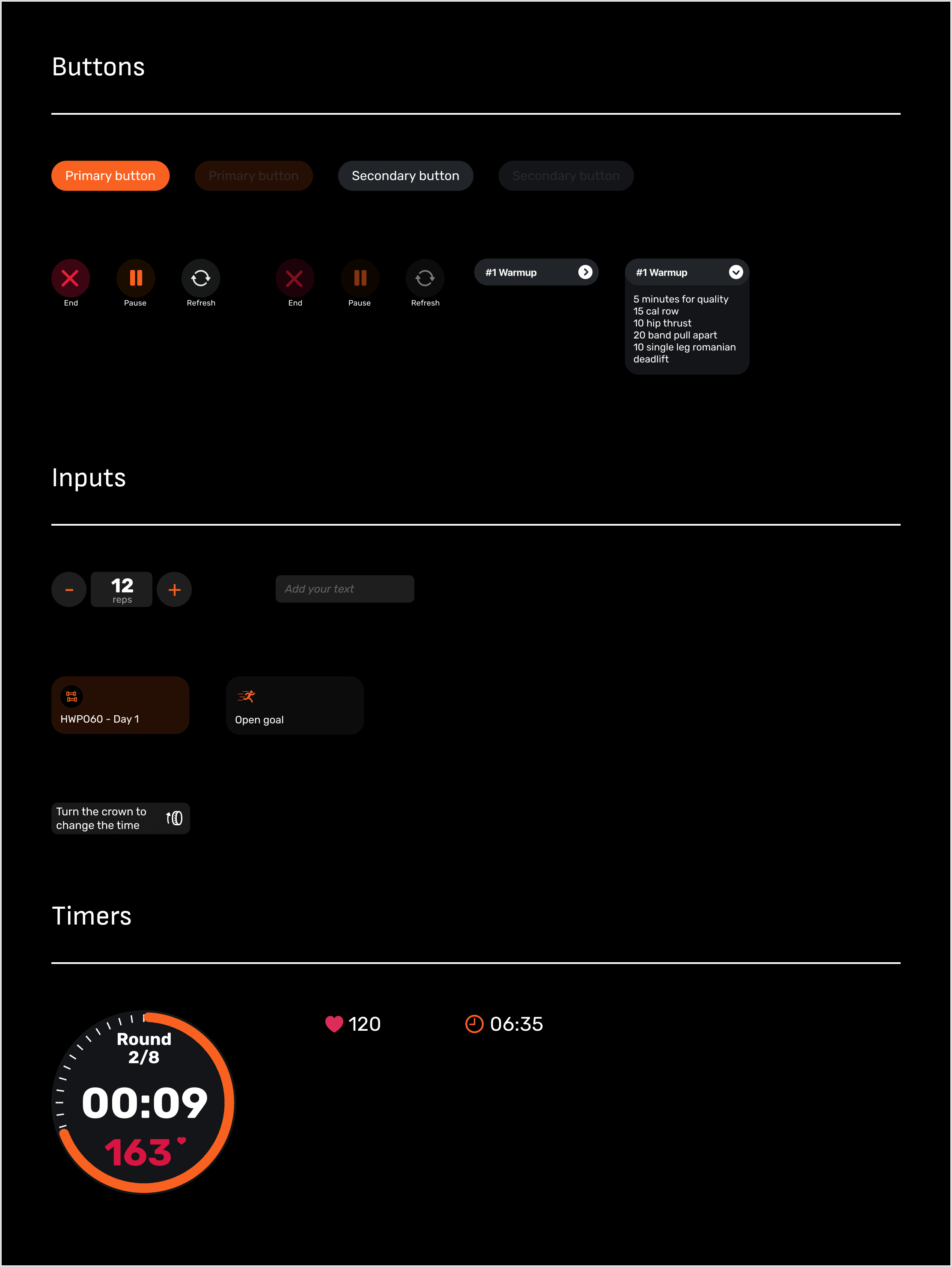
I worked on a design system to speed up the design process by building the reusable components, and improve the consistency and usability of the app by providing clear and consistent visual language. Implementing these changes allowed us to move forward with testing and feature implementation roughly by 3x on average.
Logo
Colours


Typography

iOS App Elements

watchOS Elements
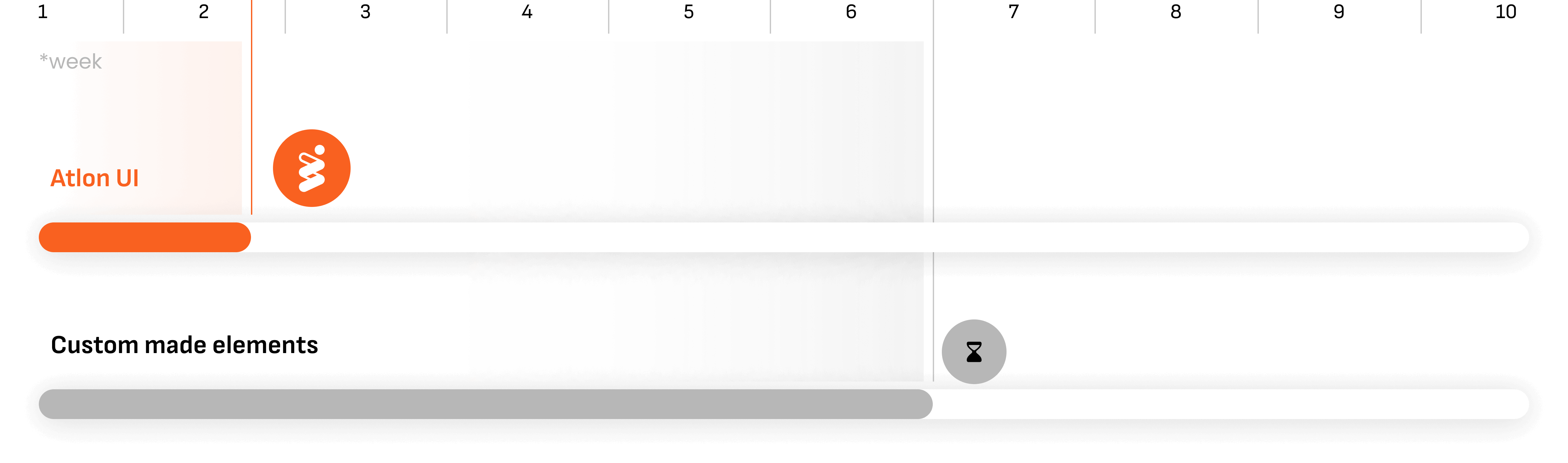
Following the implementation of the components, there was a remarkable enhancement in feature delivery. It helped reduce our production time by over 50% *Design and development time.
Previously, the design and development phase would span 4-6 weeks, but with the integration of a design system, the entire process now takes only 1-2 weeks.
Typography
As months passed by, with countless rounds of prototypes and user testing, the app and the brand evolved. Starting with the very messy and dark interface and very few features, we converted the entire product towards a more useful, playful and mature design language and introduced a lot of new useful features.
iOS App


watchOS App


To fine-tune the ultimate solution, I engaged in numerous rounds of UI iterations, testing, and technological exploration. These efforts were instrumental in refining the interface and product, ultimately leading to its successful deployment on the app store.

iOS App

The fresh design, usability improvements, and new features positively impacted our business. We gained over 210k minutes of workout time, over 1M reps recorded and over 7k workouts recorded. With these improvements and data, we made it to pre-seed funding of 2.7M DKK.


